Mobile-First Designs
Mobile and tablet devices have already surpassed desktop as the most popular method of accessing the web. As such, the advice to develop the design from mobile-first is everywhere. At least from a developer's perspective it is easier to produce the most physically restricted layout first and scale up as opposed to the seemingly popular practice of developing for the desktop and pulling things out or making things fit.
The go-to solution for a designer tends to be to design the desktop version and either produce one page in mobile form, or not at all. The developer is left with the responsibility to make the rest of the design work for mobile which can easily involve removing some features which are meant to be there by design. Despite mobile's popularity and importance, this suggests to me that the mobile version is seen as an after-thought, or simply a developer's issue. When it comes to implementation, this immediately restricts the developer's approach. Bootstrap, Foundation, and other responsive frameworks expect your default CSS to be the mobile CSS. Any media queries then scale things up as screen real-estate becomes available. This causes the CSS to be far more maintainable and predictable - media queries are only scaling in one direction, as opposed to bolted on to make it work in whichever order the developer worked at.
Whilst the designer and developer can sit together and decide on a user-interface widget to handle the lack of space for a given problem, this tends to lead to a "just use a hamburger menu", or "shorten the wording", or "reduce the font size" - quick solutions which reduce confidence in the implementation because it's an after-thought, and not a mock up which says "this is how we need it".
By providing even one mobile design, the developer has somewhere to start. This design at least tells the developer how you intend the header, footer, and main content areas to be, as opposed to the developer trying to guess the intention and potentially using much-needed man-hours on work which could end up rejected.
Developers have to cater for the following sizes, if for sake of argument we use Safari's defaults as a rule of thumb:
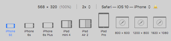
We have nine different screen sizes, but it goes further than that. Each of the tablet sizes additionally has landscape-half, landscape-small, landscape-large, portrait, portrait-thin, and portrait-half. The mobile sizes have both landscape and portrait each. In total, we have thirty modes just from Apple devices. Luckily, some of these dimensions share huge similarities from a media-query point of view, but the difference in physical screen size can make differences with image sharpness, amongst other tiny-but-relevant tweaks.
I am not saying a designer needs to create thirty different mock-ups of each page - that would be irrational. By providing the mock-up for mobile, tablet, and desktop, the developer has everything they need to make it work for the remaining sizes. The divided screen-sizes of the tablet devices are more or less catered for by the mobile break points but they still require testing, and adjustments are very minimal.
It is the designer's responsibility to ensure the design looks right. By ignoring mobile devices, this forces developers to bear responsibility for the designer's seeming apathy towards anything but the desktop device. In a web accessed more and more by mobile devices, this approach is not doing justice on the project.
Implementation good practices
Developers - you will get good results if you follow these guidelines:
- Implement for the smallest screen-size first, and build your way up to the largest (desktop) version. Trust me, this is the suggested method for good reason.
- If you cannot do step one because of a lack of a design mock up, generally position the elements until one is provided.
- It is not necessary to get the positioning, gutters, sizes etc 100% exact to the mock-up. Given the sheer range of devices, resolutions, dimensions, and browsers this is not a realistic requirement. However, it should be consistent in each browser, and certainly as close as can be rationalised given any limitations of the device or browser.
- Ensure you use your browser's responsive design mode in order to test the different sizes. There are more discrepancies between simply dragging the browser window size in, even if the dimensions are pixel-perfect. Safari's responsive design mode at the moment seems to be spot on to how iOS Safari will see it, and I have not (yet) had one layout issue since. You do still need to test on the actual devices.
- If you don't have an Android device, you can easily install an Android emulator regardless of whether you develop on OS X, Windows, or Linux. If you don't have an iPhone (or iPod Touch at least), then you can emulate iOS devices through xCode, but only if you are using a Mac.
Designers, you will seriously help the developer by following these guidelines:
- Provide at least one mock up of the project on mobile, tablet, and desktop. Pick the page (or pages) which cover the most elements and concepts of the project if you are not in a position to do all of the pages.
- Ensure that when the mock up is viewed at 100% zoom (actual size), that the font sizes, margins, widths etc are accurate. The developer will usually measure the elements pixel-wise and apply this in the styling, at least as a basis.
- Identify font families, weights, and sizes, and keep them consistent. It saves a LOT of time if the developer can configure these right at the start for each screen size.
- It is realistic to use smaller font sizes on smaller devices across the entire design. In fact Foundation has a separate font-size configuration for the smallest break point.
Whilst I am clearly biased towards a developer's point of view, I am also writing this from a project management perspective. Mobile devices are far too important to be an after-thought, and so many issues can be resolved with just a little more direction from the designer in this case.