Website Re-design
A new year prompted the temptation to have a go at designing a website.
Out with the old..
My old website was a first attempt at really branding myself but I started feeling somewhat tense at the thought of looking at it as the months went by. With projects fast approaching, I spent less than a week building it and writing the content.

Many people thought it was built in Wordpress, and it's easy to see why. The design was actually from a Wordpress template which I "ported" to Symfony. I liked its subtle effects and clarity, but felt I was trying to find reasons for pages to exist in order to make the most of the template.
Each service was on a different page and didn't really convey the right message. My mindset was much different a year ago - I had made the break from full-time employment to freelancing and was writing the content on a wave of optimism and the incredible boost of gaining a very large, and very interesting project.
There was a "Technology and Frameworks" page which went into the reasons as to why someone might use Symfony, Wordpress, or Opencart. It was redundant information, and not very interesting. The "Tools and Languages" table has been kept, but altered as necessary as usage has changed since then.
Each page had a huge banner which dominated the page without really adding anything. In fact, some pages' content was less than the height of the banner image.
In with the new
The new website aims to remove all the flaws of the old. Images have a purpose and the page is designed not to distract from the content. It scales very well between devices. Anchors go to different pages, as opposed to scrolling within the same page, as was the case with the old version's home page. Not wrong, but not ideal either.
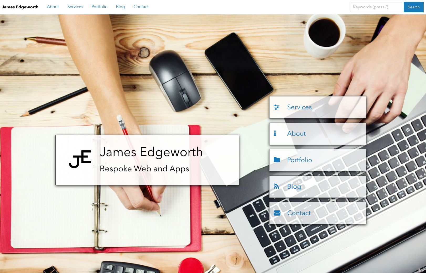
The design is my own. It is not a template. Everything has been sized or placed for a reason.
The home page purposely lacks the same layout as the other pages. It is the first impression, and contains a hero element, includes a logo, and a quick list of the main areas of the website. There really isn't need for anything else at this point.
The logo will be on my email footer and business cards. If someone recieves either, then the logo being on all says this is definitely the person behind the website. The logo is nothing more than my initials loosely resembling the Pi symbol.
The blog will contain content for humans, as opposed to being written with the aim of appeasing the Google bots. The audience are human, and it is written by a human. This is in contrast to the old website which didn't even have a blog.
The services are now condensed into one page and re-written (and will probably be re-written again in the not too distant future).
There are now two technology listings on the "About" page - one listing tools and frameworks which I use day in, day out, and another for those which have been used at least enough to deserve a mention. Though I am still admittedly divided on whether this second table should be there at all.
The footer was going to be rather more significant until it felt like I was trying to find things to put in there. It now merely shows the copyright text, plus a social media link to my LinkedIn account. By design, it is not supposed to show on a full screen unless scrolled. It is a footer, not a feature.
The search bar is an additional functionality. The algorithm behind it isn't comprehensive, and unlikely to be used in any capacity for it to be significantly developed. It does allow for a somewhat less-known usability feature, in that pressing '/' will instantly focus the search input (providing the user is not currently in another input field).
This doesn't make me a world-renowned designer by any means (nor does it make me a designer full stop). My skillset is development, but I have enjoyed having an opportunity to lay things out how I feel they should be, in this context.